

Sydney Sixers Logo: A Symbol of Creativity and Success
|
Table of Content I. History of the Sydney Sixers Logo II. Design of the Sydney Sixers Logo III. Meaning Behind the Sydney Sixers Logo IV. Sydney Sixers Logo in Glorious Moments |
The Sydney Sixers logo is one of the most unique and recognizable symbols in the Big Bash League (BBL). With its modern design, bold colors, and deep meaning, this logo not only represents the team but also embodies a spirit of fierce competition, creativity, and passion. Let TeeAussie help you gain a deeper understanding of the Sixers emblem through this article.

History of the Sydney Sixers Logo
Sydney Sixers was one of the founding teams of BBL in 2011, and its logo has been an integral part of its brand ever since. From its debut, the Sydney Sixers logo made a strong impression with a fresh design approach, completely different from traditional cricket team logos. Over more than a decade, the team has won multiple major titles, turning its logo into a symbol of victory in the hearts of fans.

History of the Sydney Sixers Logo
Design of the Sydney Sixers Logo
The Sydney Sixers logo features a dynamic, youthful, and modern design:
- The "Sixers" lettering is stylized with smooth curves while still giving a strong and solid feel.
- The first letter "S" incorporates a cricket ball image, emphasizing the team’s sporting identity.
- Primary colors: Pink, Black, and White
- Pink makes the team stand out from other BBL clubs, symbolizing creativity and youthfulness.
- Black and White help balance the overall design, highlighting key details within the logo.
- The bold and sturdy font maintains a sense of flexibility while reflecting the agile yet powerful playing style of the Sydney Sixers.

Design of the Sydney Sixers Logo
Meaning Behind the Sydney Sixers Logo
- The name "Sixers" is directly related to cricket, as a "Six" (6 points) is the highest score that can be achieved in a single shot. This represents the team's ambition to always aim for the highest achievements.
- The cricket ball integrated into the letter "S" not only reinforces the sport’s identity but also symbolizes the team’s professionalism and speed.
- The bold color combination makes Sydney Sixers a strong brand, capturing fans' attention every time it appears on the field.

Meaning Behind the Sydney Sixers Logo
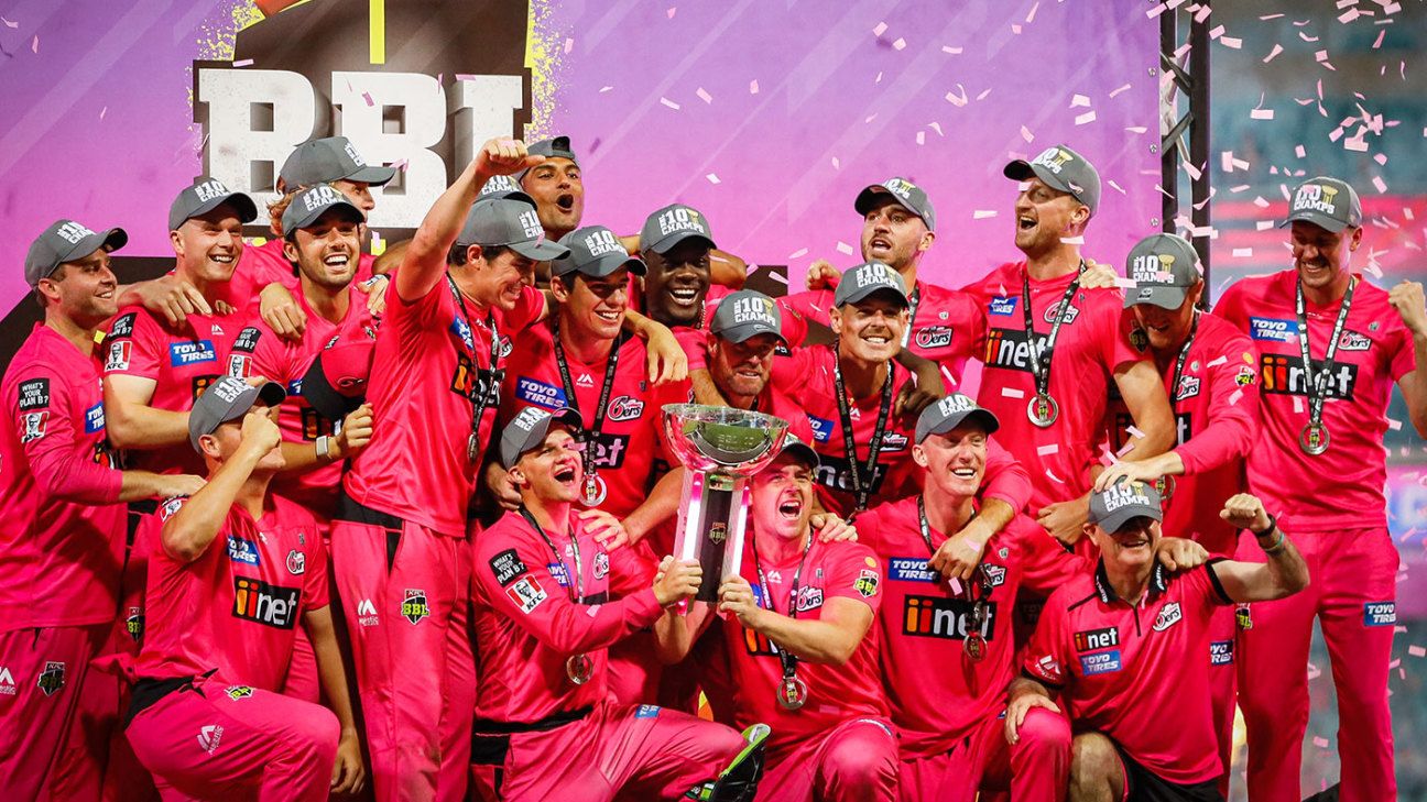
Sydney Sixers Logo in Glorious Moments
Sydney Sixers is one of the most successful teams in BBL, winning multiple championships and consistently competing for titles. Their logo has been present in unforgettable moments, from thrilling matches to emotional championship celebrations.
Another Post: Hobart Hurricanes Logo, The Symbol of the 2024 Champion
The Evolution of the Sydney Sixers Logo Over Time
Since its establishment in 2011, Sydney Sixers has become one of the top teams in the Big Bash League (BBL). Throughout this journey, the team's logo has undergone some changes—not drastic, but significant enough to reflect its growth, professionalism, and unique identity. Below is a detailed analysis of how the Sydney Sixers logo has evolved over the years.

The Early Sydney Sixers Logo (2011 – Present)
When Sydney Sixers was introduced in 2011, the team chose a relatively simple logo design, yet it effectively showcased strength and a distinct style.
Original Design
- The word "Sixers" was written in a stylized font, featuring smooth curves while still maintaining an athletic feel.
- The first letter "S" was integrated with a cricket ball, enhancing the logo’s brand recognition.
- Primary colors: Pink, Black, and White
- Pink was the main color, helping the team stand out and differentiate itself from other BBL teams.
- Black and white provided balance, ensuring the logo was neither overwhelming nor unprofessional.
The Sydney Sixers logo was praised for its simplicity yet modern appeal, effectively capturing the team’s competitive spirit.

Sydney Sixers Logo in 2011
Subtle Adjustments in the Logo
Although the Sydney Sixers logo has not changed drastically over time, minor adjustments have been made to enhance its design and optimize visibility:
Refining the Lettering:
- The word "Sixers" was made more compact and sharper, improving readability across digital platforms and jerseys.
Enhancing Color Contrast
- The pink color was slightly brightened, making the logo more eye-catching in stadiums and merchandise.
- The balance between black and white was fine-tuned to create better visual harmony among different elements.
These adjustments did not alter the core identity of the Sydney Sixers logo but rather helped the team project a more polished, professional, and modern image in line with contemporary design trends.
Subtle Adjustments in the Logo Sixers
Sydney Sixers Logo at the TeeAussie Online Store
You can find Sydney Sixers logo-printed shirts or related designs at our store. Owning such a product will help you feel confident and easily blend in when wearing it to club sporting events.
The Sydney Sixers collection at TeeAussie offers over 900 different products suitable for all ages—choose the style that suits you best!
See more:
- Adelaide Strikers Logo - Exploring a Potential Team
- Melbourne Renegades Logo History
- The Meaning Of Brisbane Heat Logo
- Perth Scorchers Logo and Its Meaning
- Hobart Hurricanes Logo, The Symbol of the 2024 Champion
- Melbourne Stars Logo – A Symbol of Determination and Success
- Sydney Thunder Logo – A Symbol of Power and Energy

SHARE
Leave a comment
Related post


Business name: Teeaussie
Email: support@teeaussie.com
Address: 189 The Grove Dr, Los Angeles CA 90036, United States
Phone: +1 2138380674
Customer Service: 09:00 AM to 05:00 PM, (Monday to Friday)