History of the Manly Warringah Sea Eagles Logo
The Manly Warringah Sea Eagles logo is considered one of the most impressive representative symbols due to its evolution over the years. As one of the top rugby teams in Australia, the Eagles have garnered a strong fan base that has always shown a keen interest in their NRL logo. If you are looking to explore the history of the Sea Eagles logo, this article from TeeAussie is dedicated to you.

Introduction to the Manly Warringah Sea Eagles Logo
The Manly Warringah Sea Eagles logo, also known as the Manly Eagles logo, represents the rugby team of the same name, one of the 17 Rugby League teams in Australia. When joining the New South Wales Rugby League (NSWRL), the team chose the sea eagle as their symbol, a native bird species found along the Sydney coastline. In 1998, when the team joined the newly established National Rugby League (NRL), the logo was redesigned again to fit modern aesthetics.
The Meaning Behind the Manly Warringah Sea Eagles Logo
The Manly Warringah Sea Eagles logo features a sea eagle, symbolizing keen vision, strength, and the ambition to dominate its territory. This representation aligns with the passion and fighting spirit of the players.

The signature maroon color of the logo represents purity and relentless effort. Across different eras of the Eagles' NRL logo, a common theme emerges: the determination to rise higher and further, achieving even greater success.

The Meaning Behind the Manly Warringah Sea Eagles Logo
Evolution of the Manly Warringah Sea Eagles Logo
As a long-established rugby club in Australia, the Sea Eagles first competed in 1947, making their logo evolution more extensive than many other rugby teams. Below is a breakdown of its major changes:
1947 - 1955
- The first logo debuted in 1946 with a minimalistic design.
- It featured a maroon shield surrounding the letters "M" and "W", written in a sans-serif font.
- At this stage, while the Eagles' identity was already established, the sea eagle itself was not yet present in the logo.
Another Post: Introduction to the Canberra Raiders Logo
1956
- A major transformation introduced the first eagle imagery.
- The sea eagle was perched on a branch, incorporating the letters "M" and "W" within the design.
- The logo was framed in an oval-shaped yellow border, making it more visually appealing compared to the earlier simple design.
1957 - 1959
- A circular maroon emblem replaced the previous design, enclosing the eagle.
- The letters "MW" were placed on the bird’s tail.
- However, this version received criticism, with many believing it looked more like a seagull than an eagle.
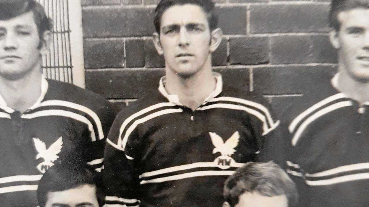
1960 - 1979
- The eagle’s design was refined to resemble an actual sea eagle, avoiding previous misinterpretations.
Manly Warringah Sea Eagles Logo in 1960
1980 - 1997
- A yellow background and circular shape were introduced.
- The abbreviations were dropped, and the full team name "Manly-Warringah" and "Sea Eagles" was written directly.
- The eagle illustration became more detailed and dynamic.
1998 - 1999
- The logo became more intricate, but some elements felt cluttered and cartoonish.
2003 - 2023
- Entering the 21st century, a minimalist approach was adopted.
- The color palette was adjusted to create a more visually appealing, modernized logo.

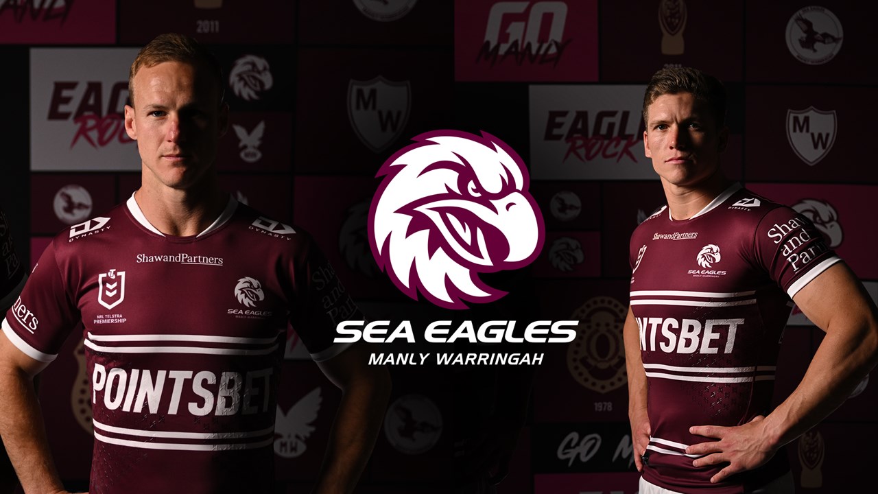
2023 - Today
- The current Manly Warringah Sea Eagles logo is considered a successful design, fully embodying the team’s spirit.
- The eagle’s face is now more majestic, exuding high determination.
- Sharp, focused eyes reflect the eagle’s readiness to strike its prey, symbolizing the team’s competitive nature.
- The feathers on the eagle’s neck resemble wings, adding depth and elegance to the design.
- Below the eagle, the team name is displayed in bold, modern typography, reinforcing timeless strength and success.

Manly Warringah Sea Eagles Logo at present
Where to Buy Manly Warringah Sea Eagles Logo Merchandise?
If you are looking to purchase apparel featuring the Manly Warringah Sea Eagles logo, check out our collection at TeeAussie. With thousands of designs, we guarantee that you’ll find something that matches your style.
This Manly Warringah Sea Eagles logo history highlights the team’s rich legacy, capturing their evolution, resilience, and dominance in rugby. Their logo is more than just an emblem—it’s a statement of strength and victory.
See more:
- Overview of the Brisbane Broncos Rugby Club and What You Need to Know
- Meaning Behind the Gold Coast Titans Logo
- Newcastle Knights Logos History
- Overview of Redcliffe Dolphins Players
- Exploring the Wests Tigers Logo
- North Queensland Cowboys Coaches – Finding Paul Green’s Successor
- South Sydney Rabbitohs Logo – A Timeless Emblem
- Canterbury-Bankstown Bulldogs Logo and Useful Information
- Melbourne Storm Logo - Meaning and Evolution
- Parramatta Eels Logo and Interesting Facts You May Not Know
- Exploring the St. George Illawarra Dragons Logo
- Cronulla-Sutherland Sharks Logo
- Overview of the New Zealand Warriors Logo
- Penrith Panthers Logo: The Symbol of the Reigning Champion
- Sydney Roosters Logo – One of the Oldest Symbols in the NRL
SHARE
Leave a comment
Related post
Business name: Teeaussie
Email: support@teeaussie.com
Address: 189 The Grove Dr, Los Angeles CA 90036, United States
Phone: +1 2138380674
Customer Service: 09:00 AM to 05:00 PM, (Monday to Friday)


