Introduction to the Canberra Raiders Logo
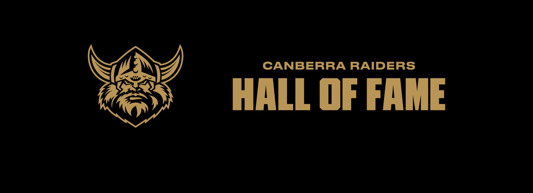
The Canberra Raiders logo features an eye-catching design with bold colors and one of the longest historical backgrounds among the 17 rugby league teams competing in the NRL. While there are not many detailed articles documenting the history of this iconic emblem, TeeAussie has compiled all the key elements that contributed to the creation of the Raiders NRL logo.

Overview of the Canberra Raiders Logo
The Canberra Raiders logo was first introduced in 1981, coinciding with the team’s preparation to enter the NRL competition. The original design was relatively simple and was based on the concept of a Viking warrior wearing a steel helmet. Over the years, the Raiders NRL logo has undergone multiple redesigns, yet it has consistently left a strong impression on fans, who feel captivated by the connection between the team’s playing style and its emblem.

Overview of the Canberra Raiders Logo
Meaning Behind the Canberra Raiders Logo
The Canberra Raiders logo features the image of a Viking warrior, a symbol that strongly represents the masculinity and toughness of rugby league. The design reflects the team’s fearless spirit, their relentless determination in the face of adversity, and their bold approach to every match.
Two additional elements that make the Raiders logo stand out are:
- The green color scheme, symbolizing endurance and resilience. No matter how much they are trailing in a game, the Raiders always find a way to turn the tide.
- The Viking helmet with horns, signifying strength and warrior-like determination.

Meaning Behind the Canberra Raiders Logo
Major Changes to the Canberra Raiders Logo Over the Years
The evolution of the NRL Canberra Raiders logo has seen significant transformations. To better understand the changes, we can break them down into four key stages:
1981 - 1999
- The first-ever Canberra Raiders logo was introduced in 1981.
- The design featured a Viking warrior with a sad expression, wearing a horned helmet.
- A bright green circle surrounded the Viking’s face, with a yellow outer ring containing the team’s name in blue capital letters.
- The design was created by Patricia Taylor as part of a competition and was selected as the winning entry.
- While some considered the design outdated, it was considered bold and unique for the 1980s.

2000 - 2019
- In 2000, the logo underwent a significant transformation, with a completely redesigned Viking face that looked fiercer and more intimidating, featuring a larger beard.
- The sharp angles of the helmet were exaggerated, giving it a wider and more aggressive appearance.
- The circular elements from the previous logo were removed, allowing the Viking head to take center stage.
- The team’s name was repositioned at the top in a bold, unified font.
- The new design was seen as a modern and professional upgrade, better suited to the intense and competitive nature of rugby league.

Canberra Raiders Logo in 2000
2019 - 2023
- In 2019, the Canberra Raiders logo was refined to make the Viking’s face appear cleaner and more polished.
- The beard and outline details were accentuated, and the team’s name was given a lighter green hue with an updated font.
2024 - Present
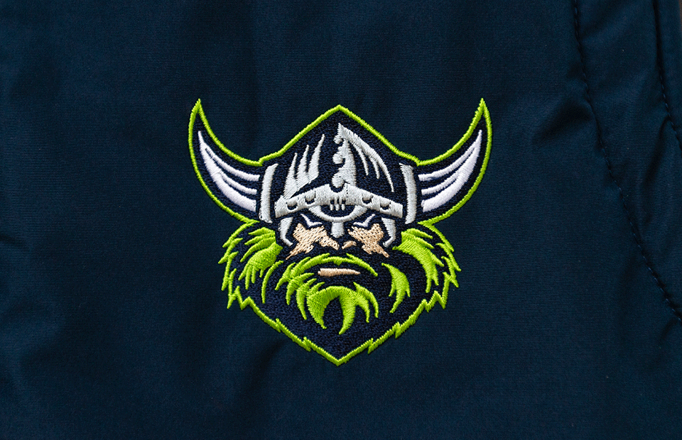
- The most recent update in 2024 focused on simplifying the design by removing intricate facial details from the Viking.
- The color palette was streamlined, featuring navy blue, lime green, and white.
- This color scheme enhances the modern aesthetics of the logo.
Another Post: Exploring the Wests Tigers Logo
Key Features That Make the Canberra Raiders NRL Logo Stand Out
The Canberra Raiders logo is unique among NRL teams due to its:
- Distinctive typography – The bold and heavy font integrates seamlessly with the overall design.
- Signature green color – Since no other rugby team in Australia primarily uses green, the Raiders logo remains highly recognizable and one-of-a-kind.
Key Features That Make the Canberra Raiders NRL Logo Stand Out
Shop for Fashion Items Featuring the Canberra Raiders Logo
Currently, Canberra Raiders logo-themed merchandise is available for purchase through the TeeAussie online store. If you are interested in apparel featuring this iconic emblem, be sure to visit the Canberra Raiders Collection and pick your favorite designs!
See more:
- Overview of the Brisbane Broncos Rugby Club and What You Need to Know
- Meaning Behind the Gold Coast Titans Logo
- Newcastle Knights Logos History
- Overview of Redcliffe Dolphins Players
- History of the Manly Warringah Sea Eagles Logo
- North Queensland Cowboys Coaches – Finding Paul Green’s Successor
- South Sydney Rabbitohs Logo – A Timeless Emblem
- Canterbury-Bankstown Bulldogs Logo and Useful Information
- Melbourne Storm Logo - Meaning and Evolution
- Parramatta Eels Logo and Interesting Facts You May Not Know
- Exploring the St. George Illawarra Dragons Logo
- Cronulla-Sutherland Sharks Logo
- Overview of the New Zealand Warriors Logo
- Penrith Panthers Logo: The Symbol of the Reigning Champion
- Sydney Roosters Logo – One of the Oldest Symbols in the NRL

SHARE
Leave a comment
Related post
Business name: Teeaussie
Email: support@teeaussie.com
Address: 189 The Grove Dr, Los Angeles CA 90036, United States
Phone: +1 2138380674
Customer Service: 09:00 AM to 05:00 PM, (Monday to Friday)


