

Carlton Football Club Logo: History and Meaning
The Carlton Football Club logo belongs to one of the oldest and most prestigious teams in the AFL (Australian Football League). The team’s emblem features a simple yet powerful design that reflects the club’s identity and pride. The logo is not just a visual representation but also a symbol of the club’s long-standing history, spanning more than a century. The primary colors of the logo are navy blue and white, with navy blue representing strength and tradition, while white enhances clarity and visibility.

History of the Carlton Football Club Logo
Carlton FC was founded in 1864, and its logo has undergone several refinements while maintaining its core identity. The most distinctive feature of the design is the interwoven “CFC” letters, which stand for Carlton Football Club. This minimalist approach not only makes the logo easily recognizable but also represents the unity and strong heritage of the club.

Introduction to the Carlton Football Club Logo
The Carlton logo does not include excessive details, yet its simplicity gives it a unique character. The combination of deep navy blue and a classic font style makes this emblem one of the longest-standing and most recognizable logos in the AFL.
Introduction to the Carlton Football Club Logo
The design of the Carlton Football Club logo carries deep symbolic meaning:
- The stylized "CFC" letters represent Carlton Football Club in a minimalist yet powerful manner. The traditional font choice reflects durability, symbolism, and the club’s long history.
- Navy blue color symbolizes strength, stability, and prestige, while white highlights the logo’s features and enhances visibility.
- Consistency in design has made the Carlton logo a familiar and unmistakable emblem among fans.

Introduction to the Carlton Football Club Logo
Despite its simplicity, the Carlton logo effectively conveys the club’s fighting spirit and unique identity. This strong brand recognition ensures that the image of Carlton FC remains deeply embedded in the minds of supporters.
Another Post: Melbourne Football Club Logo: History and Meaning
Changes in the Design of the Carlton Football Club Logo
Although Carlton is one of the most historically rich teams in the AFL, its logo has not undergone many drastic changes. Most modifications have been minor refinements to adapt to modern aesthetics while preserving the club’s iconic identity.

Pre-1920s
Carlton’s logo primarily appeared on jerseys as a simple navy blue “CFC” monogram. At this stage, the logo did not have an official design but served as a symbolic element on players' uniforms.
Carlton Football Club Logo pre-1920s
1927 - 1997
During this period, the Carlton logo was refined to become clearer and more distinct. The thickness and proportions of the letters were adjusted to improve visibility on jerseys. This era marked the logo’s transformation into the club’s official emblem.
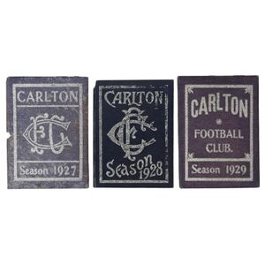
Carlton Football Club Logo in 1927
1998 - 2019
For two decades, Carlton FC continued to use an enhanced version of the 1920s design, with sharper details and improved clarity. The logo maintained the interwoven “CFC” symbol but was modernized to suit contemporary design standards.
2020 - Present
The current version of the Carlton logo features sharper lines, making it more legible on jerseys, media platforms, and club merchandise. However, the overall design remains true to its origins, with the stylized “CFC” letters continuing to serve as the defining element.

Carlton Football Club Logo at present
Carlton Football Club Logo – A Symbol of Tradition and Pride
Carlton FC is one of the most successful teams in AFL history, boasting 16 Premiership titles. The team’s logo is not just a sports emblem but a lasting symbol of one of Australia’s most decorated football clubs. Its simplicity and profound meaning help Carlton FC maintain a strong presence in the hearts of its fans. If you’re a devoted supporter of the Carlton Blues, owning a jersey in TeeAussie or merchandise featuring the team’s logo is a fantastic way to express your pride!
See more:
- Exploring the Adelaide Crows Logo: History & Meaning
- Outstanding Essendon Players in the Current Season
- GWS Giants Logo And The Story Behind It
- Port Adelaide Logos History
- Exploring West Coast Eagles Logo
- History of the Brisbane Lions Logo
- Fremantle Logo And The Meaning Behind
- Hawthorn Logo History
- Richmond Logo: The Legendary Tiger Mascot in the AFL
- Western Bulldogs Logos History
- Geelong Cats Logo: History and Meaning
- St Kilda Logo: History and Meaning
- Collingwood Logo: Understanding Its Meaning and History
- Gold Coast SUNS Logo: History and Meaning
- North Melbourne Logo: Meaning and History
- The Meaning Of Sydney Swans Logo

SHARE
Leave a comment
Related post


Business name: Teeaussie
Email: support@teeaussie.com
Address: 189 The Grove Dr, Los Angeles CA 90036, United States
Phone: +1 2138380674
Customer Service: 09:00 AM to 05:00 PM, (Monday to Friday)