Collingwood Logo: Understanding Its Meaning and History
|
Table of Content I. Overview of the Collingwood Logo II. Meaning of the Collingwood Logo |
The Collingwood logo represents one of the oldest clubs in the AFL. Compared to other sports logos, Collingwood’s emblem stands out with its unique design. More than just a symbol, it carries over a hundred years of heritage and culture. Let’s explore with TeeAusiee some key facts that may interest you.

Overview of the Collingwood Logo
The Collingwood logo was first introduced in 1892, making it one of the rare cases where an AFL team launched its logo at the same time as its establishment. The original logo featured a magpie perched on a branch, a symbol that became so well-known that opponents began referring to the team’s players by the same name. Throughout its first 50 years, Collingwood established itself as a dominant force, winning multiple AFL championships and making its emblem widely recognized.
Overview of the Collingwood Logo
Meaning of the Collingwood Logo
Like other AFL clubs, Collingwood chose a mascot that represents its playing spirit and cultural identity. For Collingwood, that mascot is the magpie—an intelligent and energetic bird. By using this image, the club conveys a message that its gameplay focuses on effective strategies and adaptability. This ideology has influenced the team’s playing style and criteria for recruiting players.

Meaning of the Collingwood Logo
Evolution of the Collingwood Logo
Let’s take a look at the major changes the Collingwood logo has undergone to become the version we see today.

1892 - 1950
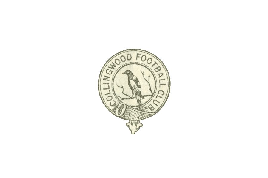
The first Collingwood logo was a successful design that remained unchanged for over 50 years, despite its early release. It was also the first recorded instance in sports history where a team used a magpie as its emblem. The initial design was simple—a circular logo resembling a coin, featuring a magpie perched on a branch, looking to the left. The name “Collingwood Football Club” encircled the emblem. A unique detail was the belt-like design element at the bottom of the logo.
Collingwood Logo in 1892
1941 - 1960
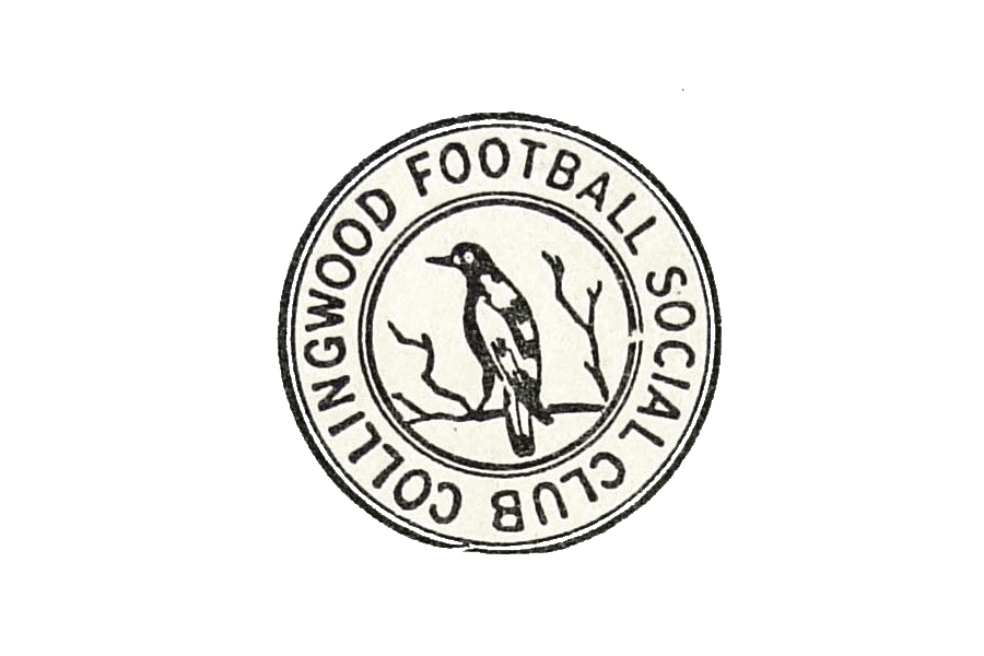
In 1941, the Social Club’s establishment attracted more members, leading to the addition of the word "Social" to the logo. The design also became more refined, removing the belt-like border from the previous version.
Collingwood Logo in 1941
See more: Gold Coast SUNS Logo: History and Meaning
1951 - 1955
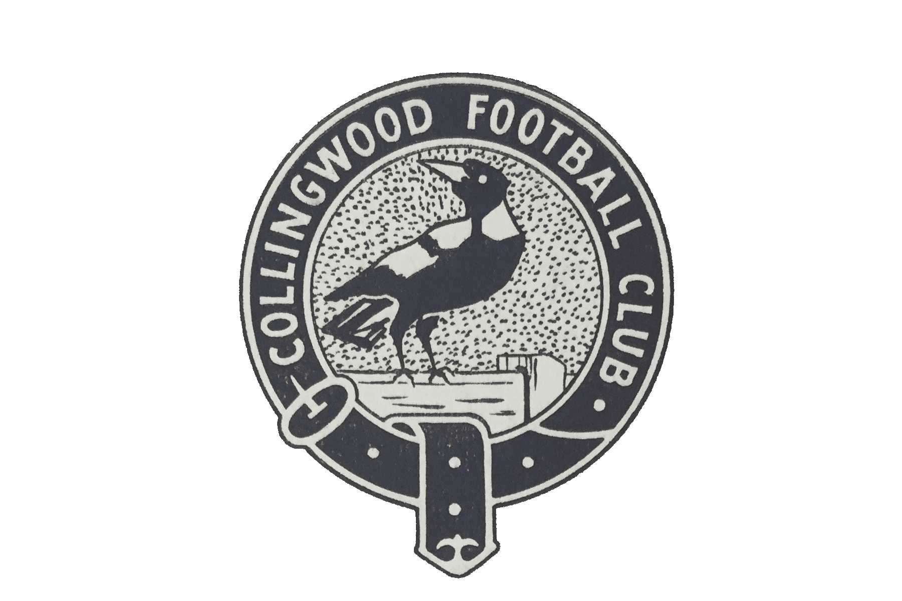
The 1951 redesign significantly altered the logo’s key elements. The magpie’s body now faced right, but its head still looked left. Instead of perching on a branch, the bird stood on a fence. The surrounding circle was redesigned to resemble a leather belt with an extended section at the bottom.
Collingwood Logo in 1951
1958 - 1965
During this period, the Collingwood logo took on a highly detailed, photographic style, making it appear too realistic. This drastic shift was not well received by fans.
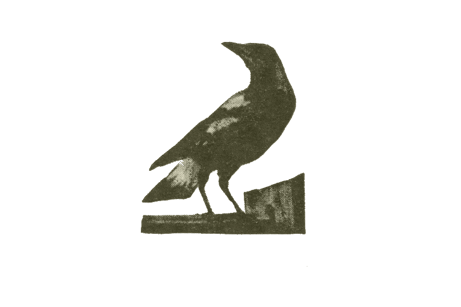
Collingwood Logo in 1958
1966 - 1967
The club reverted to a design similar to its earlier versions but retained some of the realism in the magpie’s depiction. The details were carefully rendered.
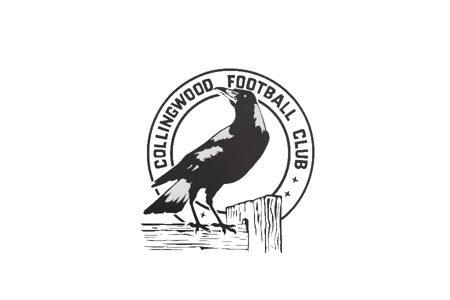
Collingwood Logo in 1966
1978 - 1981
During this phase, the Collingwood logo adopted a more standardized AFL logo format, incorporating a shield divided into two sections. The top half displayed the team’s name, while the bottom half featured a magpie inside a white rectangular frame. A navy blue "V" and dot symbol appeared on the bird’s chest.
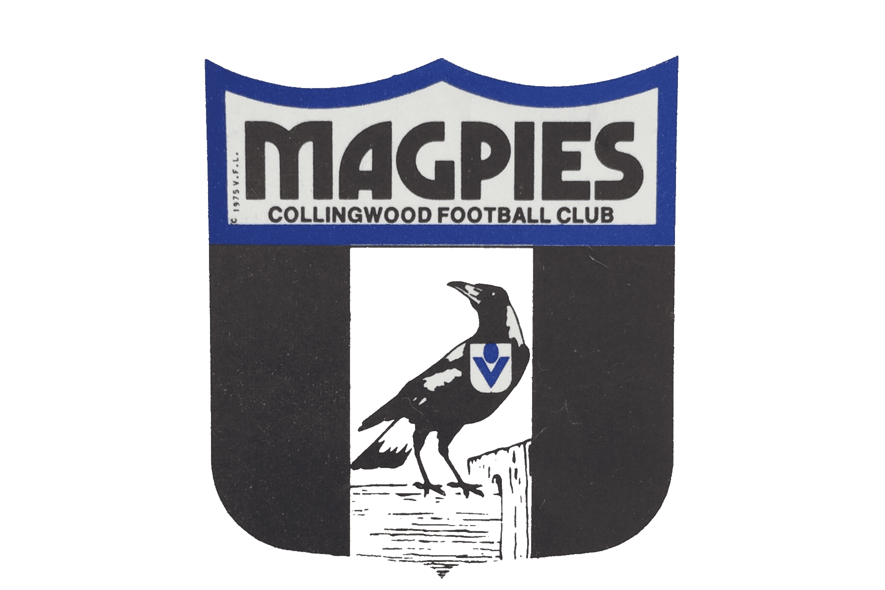
Collingwood Logo in 1978
1982
The logo underwent another modification, depicting the magpie facing left with its body turned right. Two white stripes were added on either side, and the badge on the magpie’s chest was removed.
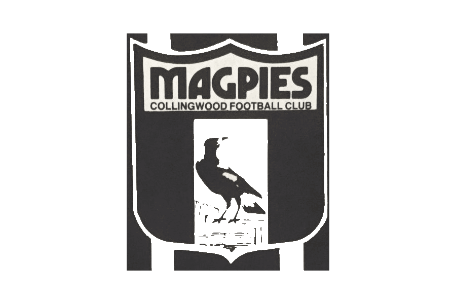
Collingwood Logo in 1982
1983
The club reverted to using a circular frame and the magpie image, similar to earlier versions. However, the white background was blurred to highlight the bird.
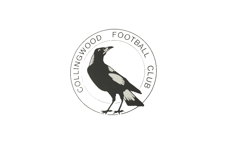
Collingwood Logo in 1983
1984
This version of the Collingwood logo featured a magpie with fully spread wings, illustrated with intricate detail.
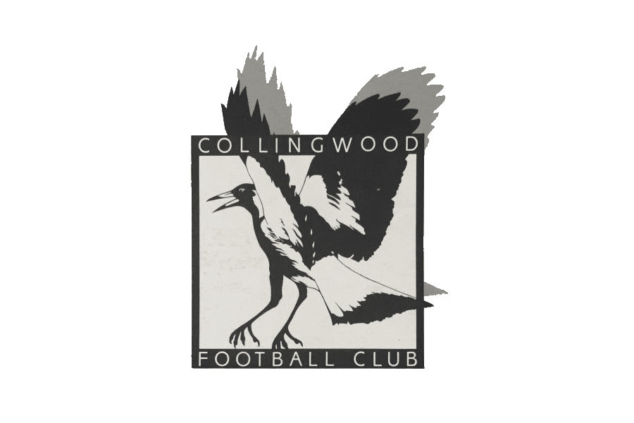
Collingwood Logo in 1984
1985 - 1991
The 1985 logo was essentially the same as the previous circular version but with a bolder outline.
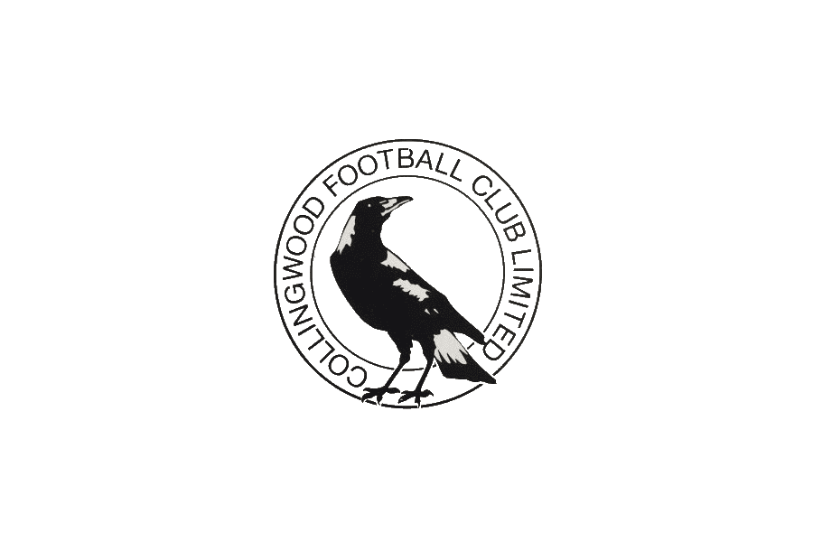
Collingwood Logo in 1985
1992
A special edition of the logo was introduced in 1992 to commemorate the club’s 100th anniversary. The circular frame was replaced with an oval, resembling an Australian football shape. A laurel wreath encased the years "1892 - 1992," while the magpie stood on a plaque inscribed with "100." Two flags were positioned on either side of the emblem. This design was considered formal and respectful of the club’s heritage.
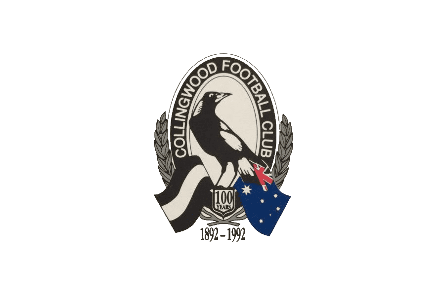
Collingwood Logo in 1992
1993 - 2017
From 1993 to 2017, the Collingwood logo underwent minor modifications, mainly adjusting certain details. The most significant change occurred in 2017 when the emblem featured two magpies instead of one. The number “125” was added below to mark the club’s 125th anniversary.
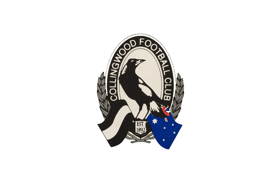
Collingwood Logo in 1993
2017 - Present
Today, the Collingwood logo has been streamlined to its most minimal form, featuring a single magpie. Behind the bird, a shield with black and white stripes remains, accompanied by a laurel wreath at the bottom.
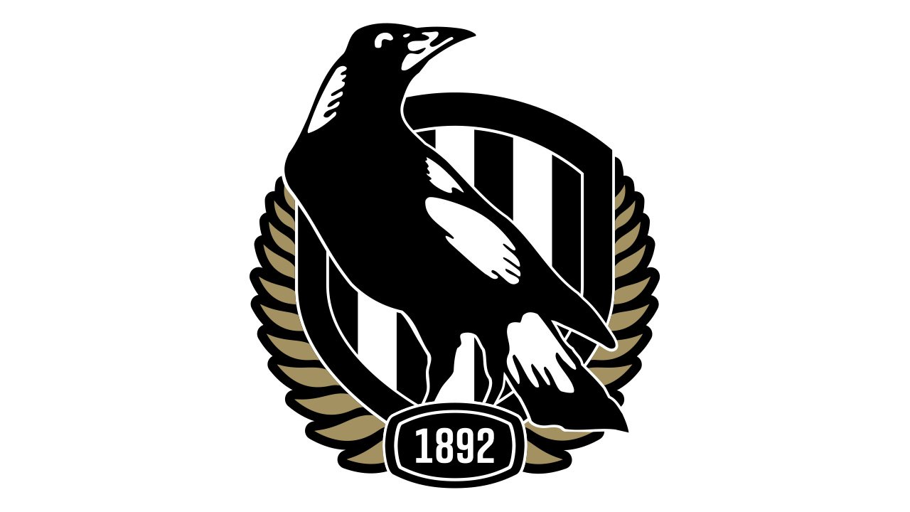
Collingwood Logo at present
Buy Apparel with the Collingwood Logo
If you’re a fan of the Magpies, owning a piece from our Collingwood collection is a must. Wearing it will help you connect with fellow supporters and show your encouragement for the players on the field. Browse the TeeAussie online store to find the perfect design for you!
See more:
- Exploring the Adelaide Crows Logo: History & Meaning
- Outstanding Essendon Players in the Current Season
- GWS Giants Logo And The Story Behind It
- Port Adelaide Logos History
- Exploring West Coast Eagles Logo
- History of the Brisbane Lions Logo
- Fremantle Logo And The Meaning Behind
- Hawthorn Logo History
- Richmond Logo: The Legendary Tiger Mascot in the AFL
- Western Bulldogs Logos History
- Carlton Football Club Logo: History and Meaning
- Geelong Cats Logo: History and Meaning
- Melbourne Football Club Logo: History and Meaning
- St Kilda Logo: History and Meaning
- North Melbourne Logo: Meaning and History
- The Meaning Of Sydney Swans Logo

SHARE
Leave a comment
Related post
Business name: Teeaussie
Email: support@teeaussie.com
Address: 189 The Grove Dr, Los Angeles CA 90036, United States
Phone: +1 2138380674
Customer Service: 09:00 AM to 05:00 PM, (Monday to Friday)


